Good Feng Shui? A Course Evaluation

We started this blog as an experiment. I was expecting this to just a writing assignment but it turned out to be more than that.

I like the blog assignment because it helps me keep up with some of the concepts we learn in class and apply them to my own interactions with the Web (apparently you capitalize the Web). For example, I was a Pinterest addict. When I first started using it I knew something was different about it, yet I couldn’t quite put my finger on it. Of course Pinterest could be analyzed in relation to almost any topic we covered in class this year. I chose to examine it as an information retrieval system. Not only am I more critical of what a website has to offer (is it Web 2.0? is it Web 3.0 yet?!) but I am also equipped with a better vocabulary to discuss it.

Similarly, writing this blog encouraged me to try out new tools and give them a test run. I learned how to use Altmetric, Wordle, Voyant Tools, TAGS, and more. Many of these are in their first stages of production. The developers from Old Bailey Online were particularly excited to hear the feedback from our class. I’m not so sure I will be continuing on for a PhD in the future (probably not ever) or will need to use these tools in the work place, but I’m sure they will be helpful when I’m conducting my thesis research. Again I feel like I have developed stronger analytical skills. I’m not going to kid myself, I have not gained any computer engineering skills in this course. Instead we gained the ability to ‘see’ websites and consider how they are organized. We can’t build websites but we sure can comment on them.

I found this class important and relevant because the future is online. Text and data mining are here to stay because of the shear volume of information made available on the web. I would have liked to have learned more about the semantic web because that’s another development of the Web that’s still in progress. I think I have gained relevant skills to be able to participate in the next fundamental change in the way information is structured online.
Old Bailey

The Old Bailey was London’s criminal court between the 17th and 20th centuries. A combination effort from 2 universities and several bodies for grant funding allows access to thousands of proceedings online. The website is set up for simple and complex searches. This makes it a great tool for researchers and students learning about digital technologies, like myself.

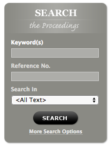
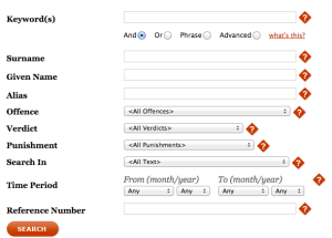
The simple search is found on the websites home page. It’s use is for generic searching or just browsing.  Or if you navigate to the search page, you have a wider variety of search options. See the respective pictures below.

Screen Shot 2014-11-30 at 10.16.56 PM Screen Shot 2014-11-30 at 10.16.41 PM

Both these searches are limited by the documents you are able to search and by the types of queries you are able to make from those documents. You can search the proceedings and the Ordinary’s Accounts dating from 1669-1772. Oliver Twist inspired by search terms as I was looking for keyword ‘bread’, offense ‘theft’, and punishment ‘public whipping’. Only 15 results came back, and unsurprisingly no Artful Dodgers.

The API let’s the user explore their results differently from the simple search. The simple search just produces a list of results. The API search allows you to explore those results. One way is to essentially search within the results that were produced by an original simple search. They term this process as ‘undrilling‘ or breaking the results down by sub category. You can also further explore these results with other tools as the API lets you export your results into Voyant. Probably because of the amount of traffic caused by our lab session, i wasn’t able to export my data. It was taking too long.


Textual Analysis…Analysis

When I hear the phrase ‘word cloud’ a memory from the HBO show Weeds surfaces in my mind (Season 6, Episode 12). The anti-hero, Nancy, is threatened by an under cover journalist getting dangerously close to the truth. Nancy scoffs when presented with a word cloud, but is then on her guard when she hears that the top 5 adjectives for her son, Shane, have aided the journalist to correctly guess that Shane is Pilar’s murder! Drama!

While wildly entertaining, this is a scene of pure fiction. I doubt word clouds will be protocol for investigating anytime soon. I also go on to doubt that word clouds will be used in serious academic writing either. New York Times journalist, Jacob Harris, considers the tool to be “the crudest sorts of textual analysis” for simply using size to indicate frequency of words used. Strong opinion considering this is coming from a guy who specializes in data journalism. On the other hand, author Julie Meloni would say the Wordle tool is simple and useful. Her evidence though is firmly based in literary examples. Creating a word cloud is appropriate for single pieces of text like poems, novels, or speeches because you are often looking for themes or patterns of rhetoric. Textual analysis in an academic setting is meant to search large amounts of texts not just one.

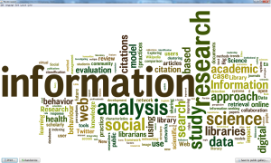
I experimented with make a word cloud of my own. First, I used Altmetric to gather articles from David Bawden’s suggested journals (listed at the end) to use in our RECS assignment all published in the last 6 months. I exported the data into a .csv file and opened in excel. Next, I simply copy and pasted all the titles into the Wordle text box.

Prescribed Titles Word Cloud

I noticed that Wordle automatically uses stop words (common words that don’t mean anything by themselves, like conjunctions or prepositions). A convenient feature, but it doesn’t have anyway for you to customize the stop words. The only alterations the user can make are superficial, things like layout, font and color. This website is a great tool for visualization, but not such a great tool for analysis.

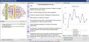
Another website Voyant-tools.org also includes a visualization of your text along with a wide variety of useful statistical tools. I’ll also mention that if you hover a word in the word cloud with your cursor then the number of times that word is used will appear.

Screen Shot 2014-11-21 at 12.32.07 AM


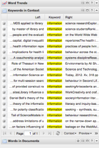
I’ll admit that I probably wouldn’t use the frequency chart very often even though it looks very analytical. Let’s just say it doesn’t speak to me. However I would use the ‘key word in context’ tool. This tool will list out the sentence a selected word originated in, thus eliminating the problem of separating signifiers from what they signify Harris described.

Screen Shot 2014-11-21 at 12.39.57 AM


In a very brief conclusion, Voyant has much more to offer than simple Wordle.

List of journals for Altmetric data set:

Journal of Librarianship and Information Science

Library Trends

Library Review

Journal of Documentation

Journal of Information Science

Journal of the Association for Information Science and Technology

Information Research


Altmetrics

The world of academia is booming. Advancements in digital technology make it possible to research more efficiently and share work with ease. The result is a massive volume of published articles and reports. There is not enough time in the day to even open all the links in your twitter feed, much less to read even a small portion of new scholarly publications.

Bibliometrics is a tool used by the academic community to measure the number of times an article is cited within academic journals. The implication is that the more a paper is cited the more impact it has. It’s kind of like the front page of the newspaper or a website. The highlights are presented up front so the reader doesn’t have to spend time combing through the rest of the paper to find articles of interest.

Metrics are a useful tool for navigating the massive volume of scholarly research being published. Alternative metrics (Altmetrics) are used to count to the number of citations an article has in non-traditional scholarly outputs. Also termed ‘grey literature’, non-traditional outputs include but are not limited to blog posts, presentations, academic posters, websites, social media, news articles.

One specific company offering an altmetric service is appropriately named Altmetric. While experimenting with the Explorer during this week’s lab session, I noticed a few similarities between it and the TAGS app I wrote about last week.

One obvious difference is that Altmetric sells its service while the TAGS app is available to anyone with a Twitter account and Google Sheets. The reason for that difference is technology based. Calculating altmertics requires a professional standard computing power, thus the client is paying for that service. TAGS is an API mashup of code offered for free by Twitter and Google. Running one simple search at a time is manageable on an individual computer. Altmetric has an advantage that by searching an article and not just a search phrase

Altmetric is still in its early stages, only a 0.1 product. There is room for more development to improve accuracy and reliability. One example of its limitations is the bias toward journals in the scientific community and not the humanities or social sciences. In the future we hope to see further expansion  into other fields.


A Little Face Lift

This week I was reading “Library Mashups: Exploring New Ways to Deliver Library Data” edited by Nicole C. Engard. It compiles 21 essays explaining library mashup projects that took place in public and academic libraries world wide. I was inspired to try a little mashup of my own.

Project Calendar:

Between Moodle, Twitter, email, and word of mouth in the LIS department we hear about a number of events and activities to enhance the course curriculum. Sometimes events in one channel don’t get heard in other channels. Or part-time students don’t hear about events advertised in courses they aren’t taking.

A great resource would be a group calendar where all events in the department get posted. Google calendar, with iCal, makes applies a change on one calendar to all others in the link. It would be very useful for everyone using the calendar to be able to post events, not just the creator.

One issue with the calendar would be access. Even if the calendar is made public and the link is sent out, it can only be viewed not edited. An authorization email has to be issued in order to make changes. Privacy prevents people listing their emails in a public forum like Moodle. Perhaps a course administrator could issue the link since they have access to everyone’s email.

I created a public calendar called CityLIS and added it to my blog as its own page in the top bar. I thought objective information made sense to place in a static position at the top of the page. That’s where users would look to find a events or a calendar. Here are simple instruction how to add your own calendar.

Visualizing Twitter: A Memoir

Before I started this course I was a Twitter-nonbeliever. The term ‘social media’ turned me away because I was already using Facebook and that was enough for me. Or so I thought. 140 character posts, known as tweets, can be seen by not only the users who follow you but by anyone who searches for certain key words. If you’re like me, a ‘shrinking violet’, the idea of your thoughts being broadcasted renders you speechless. For you, I have a few facts that might bring you piece of mind.
Good news

  1. We’re competing for attention with 284 MILLION people
  2. There are over 500 MILLION Tweets per day
  3. Twitter search function only goes back 1 week due to the enormous amount of computing power it would take to go back further

In short, it’s extremely unlikely that our tweets will be seen by the masses, and they will be buried by tweet data like tiny JSON time capsules. Using tags gives you the immediate satisfaction of participating in a larger conversation where readers with similar interests will find your input useful, without the same lasting effect as writing on a Facebook wall.

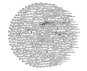
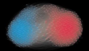
Another effect of the massive amount of tweets is the need to represent the data visually in order to include the extent of the information. Visualization as a method emphasizes the group trends not the individual. For example, in DITA this week we experimented with an application named TAGS (Twitteralytics Google Spreadsheet). It is a mashup of two APIs, one which accesses Twitter data feed , and the other a Google Sheet. The purpose of the app is to export tweets of a specified search phrase into a spreadsheet, the archive of tweets can then be manipulated in meaningful ways. I generated this image from an archive of my classmates tweets, #citylis, specifically to demonstrate how quickly muddled the results can become.

Screen Shot 2014-11-05 at 3.27.02 PM


Another example of what a Twitter community looks like was presented by the Boston Globe. The study visualizes how Congress connects on Twitter.

Screen Shot 2014-11-06 at 11.01.59 AM

I think it is safe to say that I feel differently about Twitter now than when I first started. It’s not so much an opportunity to vanity as it as an opportunity to represent yourself by the issues you care about and the groups you support. Scholar Dhiraj Murthy writes about Twitter and social identity in “Twitter: Social Communication in the Twitter Age”. A very interesting read if you are into social theory. Many of Murthy’s theories are realized with visual  interpretations. Like I said at the beginning of this post, there is so much more to Twitter than I though.


There’s an API for That

This week’s DITA session really put 2 and 2 together. Not only are things starting to click together in my non-tech savvy brain, but also literally we explored combining web services using  API’s and embedding. Wait, what?

A web service is a business that shares data across a network. The best examples are social media sites, Facebook and Twitter. Both platforms would be blank outlines without their users’ input. Facebook and Twitter are really companies that share and store users’ data. Each company has copyrighted code to handle and present the information in a specific way. That’s why facebook always looks like facebook.

APIs (application programming interface) are defining pieces of a web services code that allow data to be shared across platforms.  This allows programmers to make hybrid websites that combine everyone’s favorite elements.

For those of us who have never programmed anything in their lives (me) an easier way to combine web services is through embedding. Simply put, embedding is putting one form of media inside another. For example, the following R.E.M. video Bad Day is embedded into this blog post.

Computer scientists are way ahead of me. Even libraries are beginning to integrate ‘mash ups’ (a cooler term for API) in their tool kit. The book “Library Mashups: Exploring New Ways to Deliver Library Data” edited by Nicole Engard, is a compilation of essays used as a testimony that updating library websites with API mashups makes the website more helpful to their users. One example comes from a public library. Their website was once static. People used it to view the catalogue and check basic information about the library. The library staff started using content driven websites like Flickr to post about events going on at the library. People really liked the idea of being able to comment on and discuss events going on in their community.

Before this session I did not know any of the technical aspects to embedding media, but now that I’m aware of it, I can spot a mash up a mile away. More importantly, I’m able to evaluate and think critically about the purpose and result of combining things on the web.


How Pinterest Brightens Up Information Retrieval

Search engines are the greatest thing since sliced bread. Google Chrome turned the URL bar INTO a search box so you don’t even have to use any extra energy to navigate to Google. We have the web at our finger tips.

But do we really want or need all that? Like my favorite food, asian fusion, Pinterest is the wonderful blend of Google, Facebook, and Twitter. It combines hand-picked user content with a killer visual search to present the user with links and photos to the things that interest them the most with a scrapbook-like visual display. Like all content driven platforms it requires you to make some initial interactions with other users, but after that all you have to do is enjoy an aesthetically pleasing display of pins.

The architecture of the website is part of what makes this site so cool. Pictures are displayed like a mosaic so you can view more than 1 at a time and not in a chronological order. It really does look like a digital bulletin board. The site also features an ‘endless scroll’ which means no more clicking around to see more. I love Reddit, but so..much..clicking..

Another great feature is the visual search tool which allows you to search for an image based on its syntactic image information (looks like someone read Westman). Since each picture is linked back to a webpage you are essentially browsing for information visually instead of textually.

I know I’m raving over here, but I think there plenty to say about Pinterest in terms of its information architecture and information retrieval. When the site first launched invitations to join were selective. This process produced a user group with competence and tech savvy. Over time the user population went up and the quality slightly went down. But still tags and meta data are often used correctly and that produces more accurate search results. I have yet to test the recall and precision of the search engine, but now it seems I have an excuse to look for chocolate cake recipes.


For more reading about Pinterest as a business or syntactic image information check out:

This article from New York Magazine

From Goker, A., Davies, J. (. J., Wiley Online Library EBS, & Wiley InterScience (Online service). (2009). Information retrieval: Searching in the 21st century. Chichester, U.K: Wiley. Available via City University Library.

Good Feng Shui

Feng Shui is an ancient branch of Chinese metaphysics concerned with the balancing and harmonization of energy. The philosophy was originally used for the spatial orientation of buildings and landmarks. The buildings would be arranged in such a way that ‘qi’, or central life force, could move freely and easily. Modern applications of feng shui equate the clarity of the mind with the organization of your home or work space. A clean desk is a clean mind.

In the same way, website design is concerned with the orientation of web features to enhance the experience of the user.

That being said, I chose the Adelle theme because it seemed to be the closest to the bare bones of a blog that I could get yet still has a touch of color. The pages along the top and the widgets along the right hand side allow anyone searching the blog to be able to find posts not just by topic but also in chronological order. This layout is easy to navigate and clearly organized. Good for anyone’s qi.

One thing I was toying with, having my Twitter RSS feed embedded in the sidebar. I’m writing this blog as a course assignment so it will have some level of academic and professional quality. Likewise, my Twitter account represents who I am as a pre-professional person. Both of these mediums play a role in my studies so it seems like a great idea to link the two together. I decided against embedding the feed simply for aesthetic reasons. I think it looks too busy. Instead I opted for Twitter to automatically tweet if I add a new blog post. Anyone following me on twitter now has access to this blog if they are interested.

I wonder if I will feel the same about website usability in 10 weeks time as I am writing this post now.